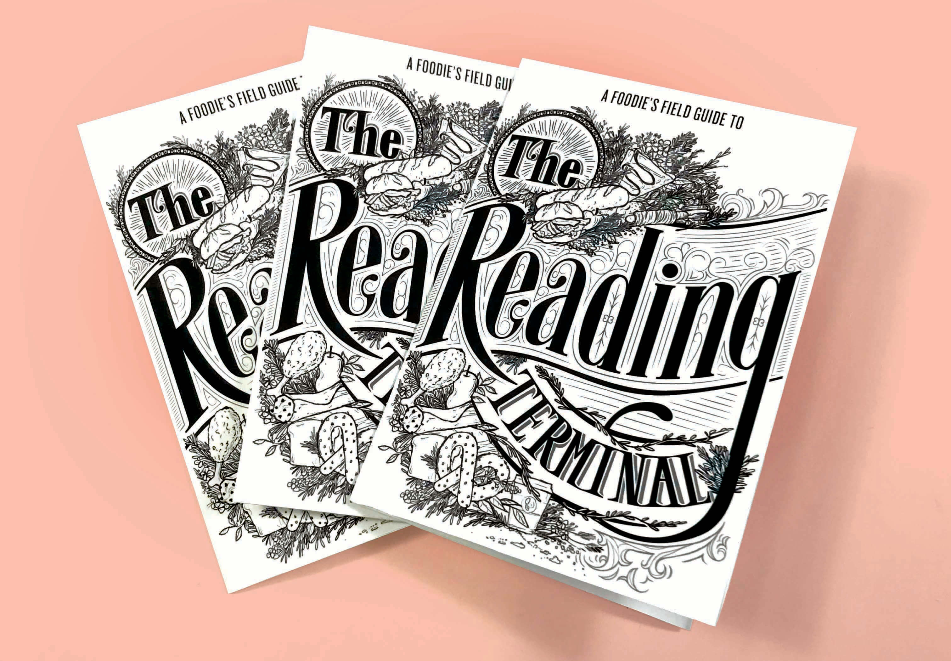
For Drexel University’s typography 3 class, students were randomly assigned a landmark/town in Philadelphia to create a brochure for. I received The Reading Terminal, which is one of Philadelphia's most iconic and oldest markets around. It is home to over 80 vendors- ranging from Amish food to sandwich restaurants to grocery stores.
To create a brochure for The Reading Terminal.
Typography and layout were inspired by old Victorian theater posters. These are initial drafts of what the brochure could look like.

This brochure directs users to vendors by the hour- spotlighting them for their unique offerings that are best enjoyed at a certain time. The brochure also engages the audience with fun tongue in cheek language. To dial back to the Terminal's origins, hand done typography/imagery was incorporated into a soft rebrand.


Web Format : To take this project one step further, a website was created to explore what the Reading Terminal could look like if it rebranded itself based off of the brochure. To access the prototype, click here, or check out the video for the demo below!
return to work