People lose their vision for a variety of reasons. Often, they are left with little time to adjust to a lifestyle of using their other senses in lieu of their sight. While there are many tools and resources to help people adjust, they tend to be hard to obtain, require a lot of time, and/or are uneconomical.
This project builds upon Tran-Sans, a typeface to help users transition to learning grade 1 braille.
To research, ideate, design, and prototype an accessible learning resource within the span of 10 weeks.
Within the first week of starting the project, preliminary research was done by referencing journals from researchers, articles by scholars, as well as blogs/ opinion pieces done by those with visual impairments to get a holistic understanding of their experiences.
A question eventually came up from the research: how do problems scale as people lose their vision? I did an affinity mapping exercise to categorize all of the notes I accumulated.

The pain points accumulated from the research were sorted into 3 categories: full sighted, partial vision, and blind. Overall, the problems exponentially grew as a person loses their vision. Understanding the uncertainty of navigating a new environment was crucial in selecting a platform and medium as a learning resource. In addition to this consideration, COVID-19 was declared a pandemic during the early stages of this project, which ultimately pushed me to look at the web as the platform to design, build, and test for. Anyone at any age can experience visual impairments for a variety of reasons. However, what is crucial for this website is that it demystifies their experiences to mitigate confusion and anxiety. 3 user personas were created to address the needs of those who would benefit from using this website.
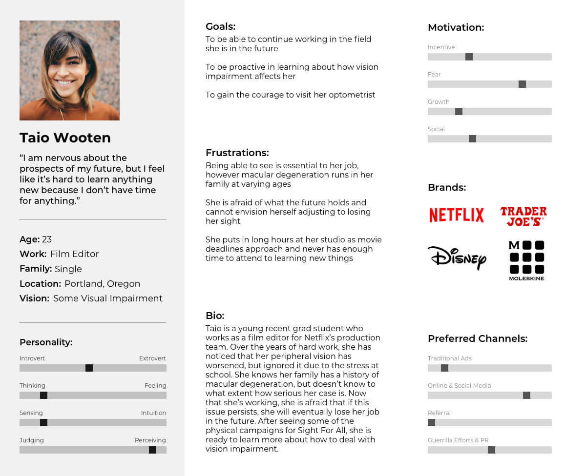
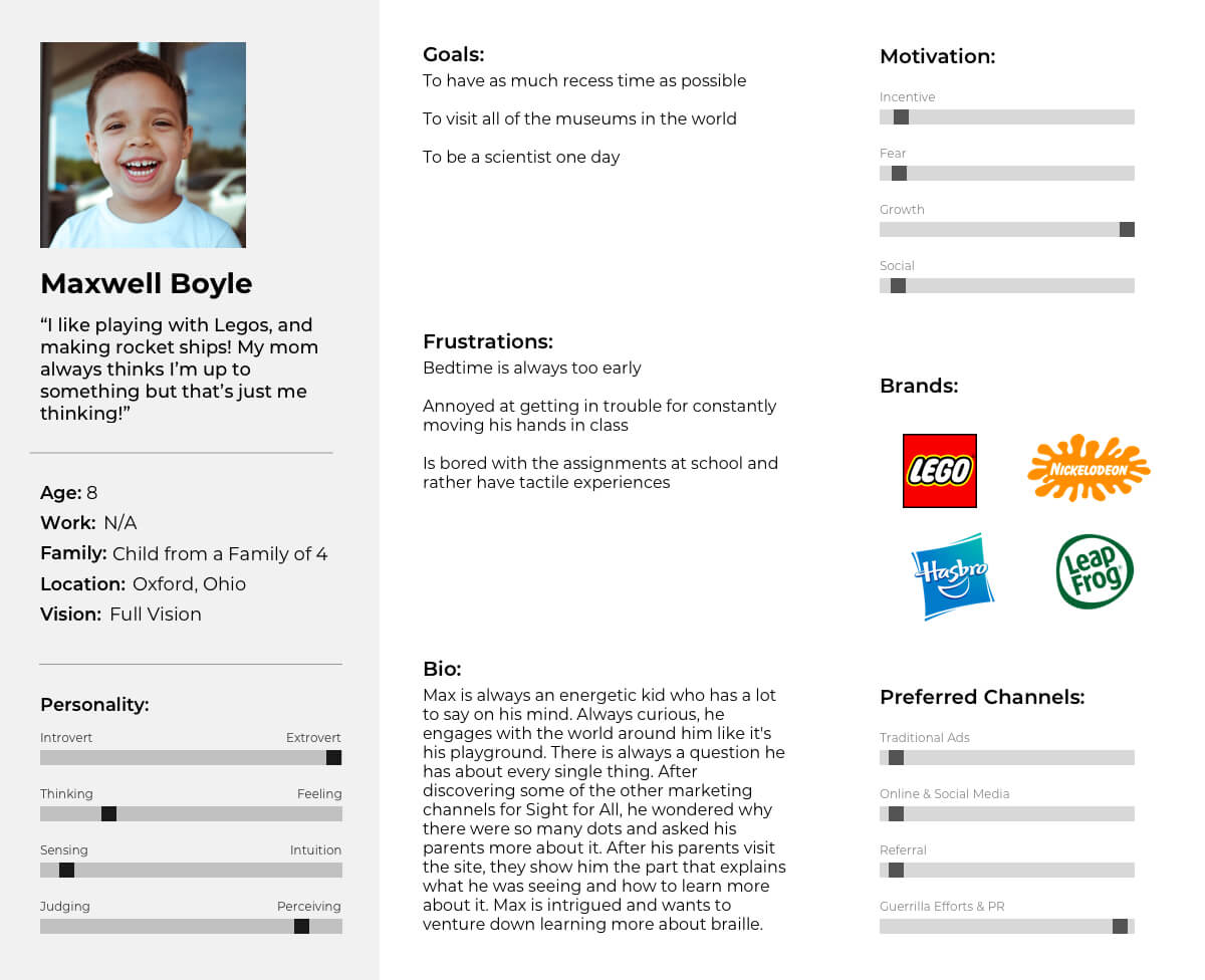
User persona of Taio Wooten: a film editor with some visual impairment. Click on the image to view the other two personas.
Once I had a better understanding of who I was designing for, I ran 3 ideation sessions that were 8 minutes long each to produce the goals of the website.
Soft Goals
Informative
High visual impact
Educational
Destigmatize learning braille
Simplified information
Straight to the point
Inclusive
Kid friendly
Hard Goals
Have audio components
Large text
Accessible by audio readers
Visuals for more informative blocks of information (such as graphs, charts, supporting imagery)
Maintain ADA accessibility
Overall, there needed to be a high focus on education and ease of use for this website. There were 2 more ideation sessions to explore how education could be fun and engaging amongst different age groups. This site map was generated with additional context for information and components.

Once the initial site map was initialized, I collected, curated, and created the appropriate content.
In parallel with the research, I worked on the website’s brand and identity. After exploring options for names to capture the spirit of the brand, I landed on Sight For All.
Mission
Sight For All’s mission is to destigmatize learning braille. They believe that people are capable of achieving anything and hope to be the steppingstone everyone’s visual journeys.
Personality
Simple
Clean
Inclusive
Bright
Expressive
Proactive
Messaging
Straight to the point
Provides facts
Provides uplifting messages
These are experiments with the typography, color, logo, and imagery.


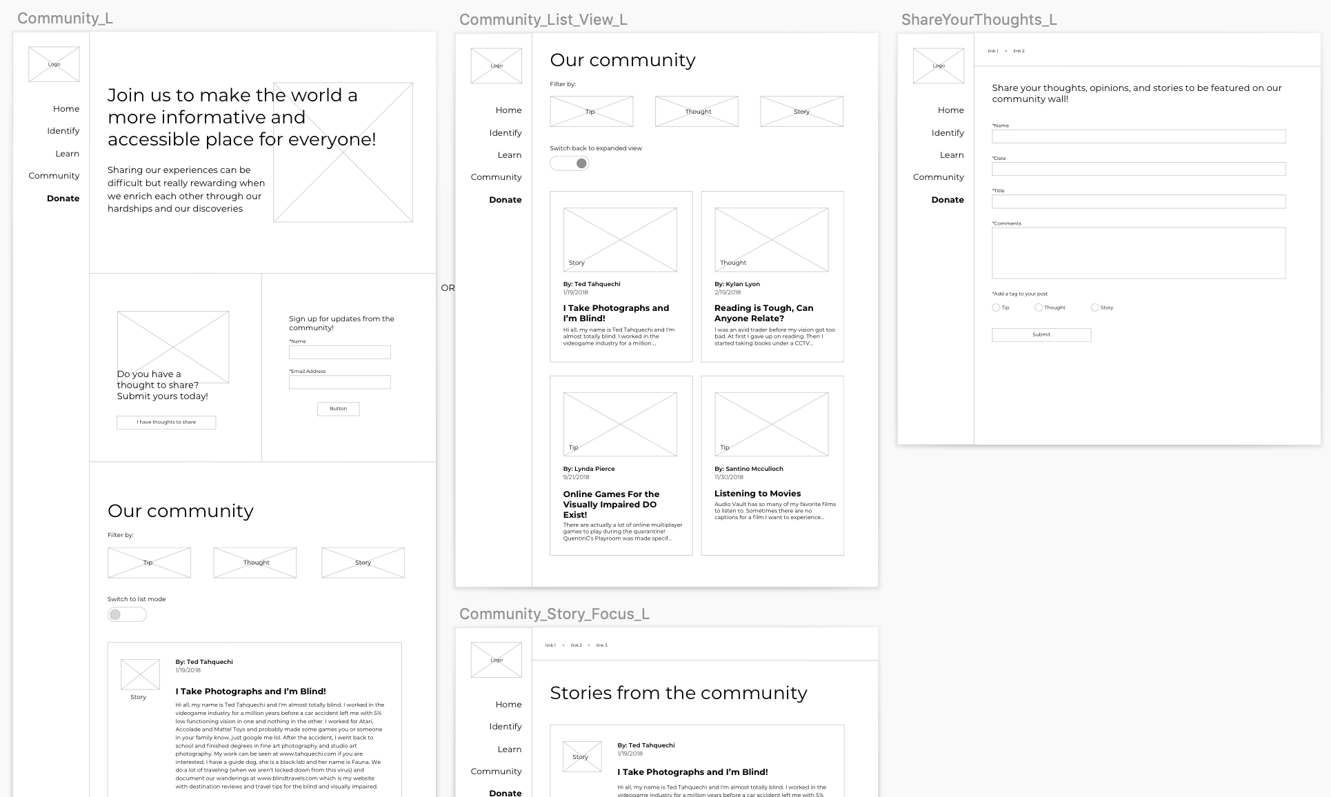
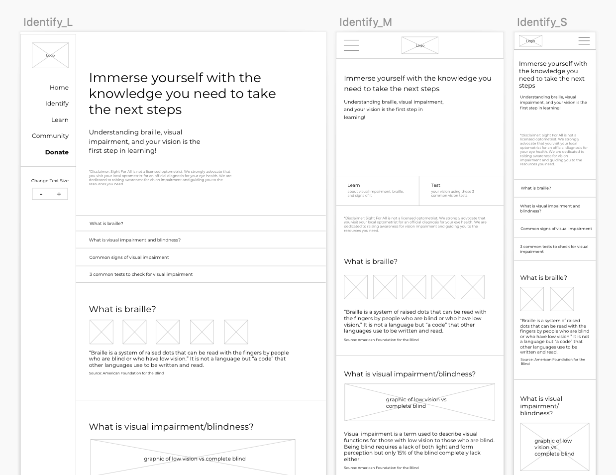
Some snippets of low and mid fidelity wireframes created in Sketch.


Finalized logo, typography, color, and, palette imagery.

Finalized UI kit.

Finalized site map.

To access the working prototype, click here or view a walk through of the home page below.
If there was an extension of this project, I would include more user testing to test out factors such as retention of information, ease of locating information, and screen reader compatibility. I would also go back and reexamine the branding to make sure that the website aligns with its goals. Another area to focus on is whether Tran-Sans translates well on the web and seeing if there could be adjustments made to make it more web friendly.
I would also consider other experiences to enrich the website: what if there was an app that users could speak into that would translate and add a user’s experiences to the Community portion of the website?
In addition to this, I would love to explore how Sight For All can be translated into a multi pronged campaign that incorporates the same principles to physical products like food packaging, household items and public spaces while taking into consideration how societal views on contact have evolved.
What I learned from doing this project is that the best thing a designer can do is to listen to the voices of others to foster diversity of thought and better products.
return to work